As an Amazon Associate, we earn from qualifying purchases. Some links on this site are affiliate links at no extra cost to you. Our recommendations are based on thorough research and editorial judgment.

Macos Font Smoothing: Sharper Text and Accessibility
Font smoothing in macOS enhances text clarity, making it easier for us to read. By reducing jagged edges, we experience improved legibility, especially on smaller fonts. We can enable or disable font smoothing through Terminal commands, customizing it to our needs. Levels range from no smoothing to strong smoothing, allowing us to find the best fit. Coupled with good display resolution, this feature notably boosts accessibility. If we explore further, we’ll discover more about optimizing our visual experience.
Key Takeaways
- Font smoothing enhances text appearance by reducing jagged edges, improving overall readability on macOS devices.
- Customizing font smoothing levels can significantly aid accessibility for users with visual impairments or dyslexia.
- Users can toggle and adjust font smoothing settings through Terminal commands, experimenting with levels for optimal clarity.
- Reducing smoothing may enhance legibility for small text, catering to different monitor types and individual preferences.
- Enhanced font clarity contributes to a more inclusive digital environment, supporting extended screen time without eye strain.
Understanding Font Smoothing in Macos
You may be interested


Font smoothing is an important feature in macOS that enhances how text appears on our screens. It reduces jagged edges, especially on LCD displays, making our reading experience smoother. By default, font smoothing is enabled in recent macOS versions, but we can customize this in System Preferences.
Here’s what we can do:
- Adjust the smoothing level with Terminal commands, ranging from 0 (disabling font smoothing) to 3 (strong smoothing).
- Smaller font sizes may benefit from disabling smoothing, as it can increase legibility and reduce blurriness.
- We should remember that changes often require logging out or restarting our Mac to see the effects.
Understanding font smoothing helps us customize our viewing experience for clarity and comfort. Many users also pair display adjustments with external accessories like screen light bars to reduce eye strain in low-light typing conditions.
The Impact of Font Smoothing on Readability
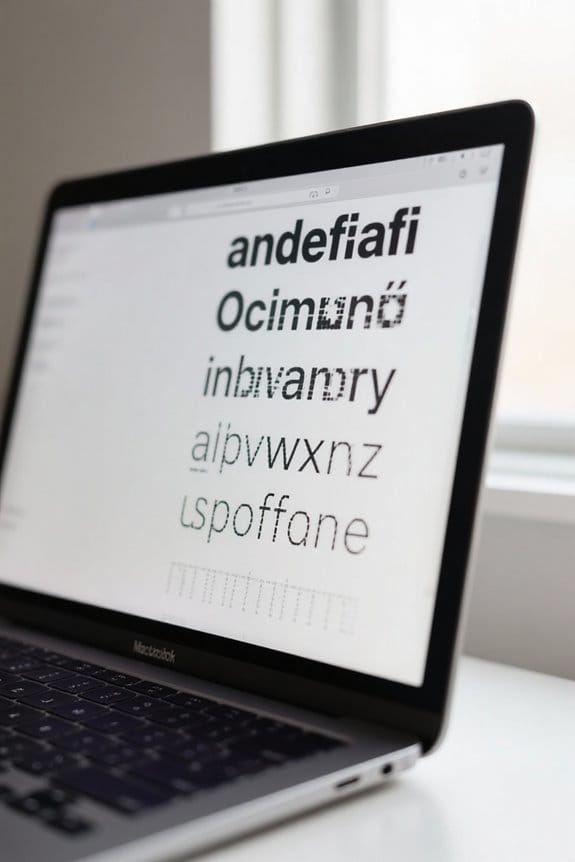
When we consider how font smoothing affects readability, we find that the adjustments can greatly enhance our experience, especially on LCD displays. Here’s how it impacts us:
- Reduces Distortion: Font smoothing minimizes visual distortions, making text easier to read.
- Supports Accessibility: For those with dyslexia or visual impairments, smoother edges help create a more comfortable reading experience.
- Adjustable Levels: We can fine-tune font smoothing in macOS using Terminal commands, choosing between levels 0 to 3 for clarity.
- Consider Font Size: Turning off smoothing for smaller text can actually improve legibility by reducing blurriness.
- Display Variations: The effectiveness of font smoothing can differ by monitor type, so custom adjustments might be necessary for ideal readability.
Let’s explore how these features improve our reading comfort. Newer display technologies and networked printing environments can both affect perceived text clarity and output quality, so consider device and infrastructure choices like USB 2.0 connectivity when optimizing for the best results.
Enabling and Disabling Font Smoothing

Enabling or disabling font smoothing on macOS is a straightforward process that lets us tailor our display preferences to improve our reading experience.
To disable font smoothing, we can use Terminal. Simply open it and run the command:
– `defaults -currentHost write -g AppleFontSmoothing -int 0`, then restart your Mac.
Prior to macOS Big Sur, we could easily manage font smoothing in System Preferences, but that option has changed. Now, it’s important to experiment with different levels of smoothing to achieve the best clarity; options include:
- 0 for no smoothing
- 1 for light smoothing
- 2 for medium (default)
- 3 for strong smoothing
Finding the right setting enhances readability, especially on LCD displays with larger fonts. High-quality external drives with effective heat dissipation can help preserve important backups of your settings and system files.
Adjusting Font Smoothing Levels via Terminal

Adjusting the font smoothing levels on macOS is an effective way to customize our visual preferences for clearer text. To do this, we open the Terminal application located in /Applications/Utilities.
We can use the command:
“`
defaults -currentHost write -g AppleFontSmoothing -int X
“`
Here, ‘X’ represents the smoothing level, where:
- 0 means disabled,
- 1 is light,
- 2 is default,
- 3 is strong.
It’s important to note that if our text looks blurry, we should experiment with these values based on our individual display types and preferences. After executing the desired command, we’ll need to restart our Mac to apply the changes effectively. Adjusting font smoothing can enhance readability, especially on high-resolution or external monitors. Many users find that high-density displays benefit most from experimenting with smoothing levels for optimal clarity.
Recommended Products

Make Your Devices Touch-enabled: This portable monitor features a 10-point capacitive touch. It is compatible with both Windows and macOS systems, allowing you to add touch functionality to your laptop/PC/Macbook by simply connecting it via the fully featured USB-C interface. MUST NOTE: For Type-C 3.1 DP ALT-MODE or Thunderbolt 3/4 ports, use a Type-C to Type-C cable for power, video, and touch. Use HDMI+power cable+USB-A to USB-C cable for devices without these ports. No extra drivers are required.

CRISP CLARITY: This 27″ Philips V line monitor delivers crisp Full HD 1920x1080 visuals. Enjoy movies, shows and videos with remarkable detail

【27 Inch 4K Computer Monitor & Stunning Color Performance】Real 4K UHD 3840*2160p monitor provide you top picture/video qulaity viewing experience, it delivers advanced IPS panel with LED Backlit Technology, 178° wide viewing angle and a frameless design, (Max)400nits brightness,1000:1 contrast ratio,1.07B(8bits+FRC)colors, 60hz refresh rate, ∆E<2
The Role of Display Resolution in Font Clarity
The clarity of fonts on our screens hinges considerably on display resolution, which determines how text appears. Higher resolutions, like 4K, enhance font smoothing and provide sharper text, making reading more enjoyable. In contrast, lower resolutions, such as 1920×1080, may lead to blurry or fuzzy characters.
To enhance our experience, we should adjust display scaling options in macOS. Selecting the “Default for display” often achieves the best balance between font sizes and text clarity. Additionally, the type of connection matters; using DisplayPort over HDMI generally results in better resolution handling, further improving font clarity. Regular system software updates can also enhance performance, ensuring that we maintain ideal settings for clear font rendering. Many users find that organizing accessories in a tech organizer can help protect and manage peripherals that support their display setup.
Recommended Products

[VESA Certified DP to DP Cable 1.4] This 8K DisplayPort Cable 1.4(NOT HDMI) is officially certified by VESA Association; iVANKY 8K DP Cable supports high resolutions 8K(7680x4320)@60Hz, 5K@60Hz, 4K@240Hz, 2K@240Hz, 1080P@240Hz and Dynamic HDR and HDCP 2.2; Backwards compatible with DisplayPort 1.3/1.2/1.1, etc; It also works fully with FreeSync and G-Sync; NOT compatible with HDMI / Mini DP
![Silkland 54Gbps 16K DisplayPort Cable 2.1 [VESA Certified] 6.6FT, DP 2.1 [16K@30Hz, 8K@120Hz, 4K@240Hz 165Hz 144Hz] HDR, HDCP DSC 1.2a, Compatible DP 1.4 FreeSync G-Sync Gaming Monitor 5090 7900XTX](https://m.media-amazon.com/images/I/41Zpb6gt3IL._SL500_.jpg)
【VESA Certified 16K DisplayPort Cable 2.1】Silkland 16K Displayport Cable 2.1/2.0 supports high resolutions 16K(15360*8640)@60Hz with DSC, 8K@120Hz, 4K@240Hz/165Hz/120Hz/144Hz, 2K@360Hz. Silkland 16K DP 2.1 Cable certified by the VESA Association. Supports Dynamic HDR, HDCP 2.2, DSC1.2a. Backwards compatible with DisplayPort 2.0 1.4 1.3, 1.2, 1.2a, 1.1 and 1.0. Support flawless audio pass-thru for uncompressed digital audio channels at 7.1, 5.1 and 2.0. Support 3D stereo imaging technology
![Silkland 80Gbps DisplayPort Cable 2.1 6.6FT/2M [VESA Certified], [8K@240Hz, 4K@540Hz 360Hz 240Hz] DP 2.1 Cable 16K, DP80 HDR DSC HDCP, Display Port Cord Compatible DP 1.4, Gaming Monitor 5090 9070XT](https://m.media-amazon.com/images/I/41ZU3eQbhEL._SL500_.jpg)
【VESA Certified DP80 Cable 2M】Silkland 6.6FT Display Port 2.1 Cable is the first VESA-certified DP80 cable on Amazon. With 80Gbps bandwidth, it supports uncompressed 4K@240Hz, 8K@60Hz and 2K@540Hz resolution. Up to 16K@60Hz, 8K@240Hz, 4K@960Hz 540Hz 480Hz 360Hz with DSC enabled. DP80 cable compatible with UHBR20, dynamic HDR10+, 3D, and HDCP 2.3 for superior visuals. Backward compatible with DP 2.0, and DP 1.4, and supports flawless 7.1/5.1/2.0 uncompressed audio pass-thru
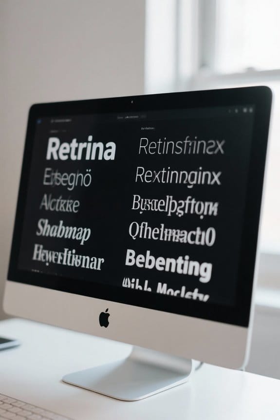
Comparing Font Rendering on Macos and Windows
When comparing font rendering between macOS and Windows, it’s essential to understand how each operating system approaches text display.
- macOS emphasizes aesthetic fidelity, which means the text looks smoother and softer. This approach preserves the typeface shape and weight, creating visually appealing text.
- Windows, on the other hand, prioritizes screen readability. It enhances clarity by adjusting font outlines to fit the pixel grid, resulting in text that often appears thinner but more defined.
These differences in font smoothing techniques greatly affect user experiences. macOS users may appreciate the artistic quality of text, while Windows users may prefer the legibility necessary for longer tasks. Ultimately, these subtleties can guide professionals in choosing the best operating system for their design work. Many users also rely on external tools like an air blower to keep their displays and devices clean, which can indirectly improve perceived text clarity.
Accessibility Benefits of Font Smoothing
Font smoothing plays a significant role in enhancing accessibility for users, especially those with visual impairments. Here are some key benefits:
- Improved Clarity: Font smoothing enhances text clarity, making small font sizes easier to read without strain.
- Reduced Eye Fatigue: By defining letter edges, font smoothing can minimize eye fatigue, which is vital for those spending long hours in front of screens.
- Customization Options: Users can adjust font smoothing settings to tailor their viewing experience to meet specific accessibility needs.
- Support for Dyslexia: Individuals with dyslexia may find font smoothing beneficial, as it improves character legibility and reduces visual distortions.
These accessibility benefits of font smoothing are essential for creating an inclusive digital environment for all users. High-density materials like high-density foam are often recommended in acoustic treatments for clear audio environments that complement visual accessibility.
Troubleshooting Font Clarity Issues
How can we guarantee text clarity on macOS? To troubleshoot font clarity issues, we should first make sure our font smoothing settings are properly adjusted. Utilize the Terminal command `defaults -currentHost write -g AppleFontSmoothing -int [level]`, with levels from 0 (no smoothing) to 3 (strong smoothing).
After adjusting these settings, we must restart our Mac to allow changes to take effect. If text still appears blurry, check that our display is set to its native resolution, which is essential for clarity. Also, consider high-quality display connections, like DisplayPort over HDMI. Finally, exploring scaling options in the Display settings may help enhance text legibility on external monitors. Many users find that pairing this with an ergonomic laptop cooling pad can improve comfort during long sessions and help maintain consistent performance from their device multiple fans.
Recommended Products

4K Ultra HD and Audio Sync: With this UGREEN DisplayPort to HDMI adapter, mirror or extend your screen and stream 4K@30Hz/2K@60Hz/1080P@120Hz video directly to your HDTV, monitor, or projector; bringing you realistic 3D video effects with clear, high-quality sound. The smooth video and audio streaming allows you to immerse yourself in true theater-quality enjoyment. Supports DisplayPort 1.2, HDCP 1.4, HDMI 1.4 and HDR, presenting you with clear images

2-PC DisplayPort to HDMI Adapter: UGREEN 4K DP to HDMI adapter easily turns DP port to HDMI port, allowing to connect DP device (e.g. PC, laptop, or graphic card) to HDMI monitor, projector, HDTV for audio & video signal transfer. It deals with no HDMI port and is also a good way to protect your ports

【What It Solves, Use Scenarios】: This display port to hdmi adapter lets a PC or desktop GPU with a full size DisplayPort output connect to HDMI TVs, monitors, and projectors. Ideal for office presentations, home big screen setup, and multi monitor extension, with up to 4K 30Hz output for clear everyday viewing. HDMI cable not included
Customizing Smoothing for Small Fonts
Adjusting font smoothing settings can greatly impact our reading experience, especially for smaller text sizes. Here are some key points to reflect upon for enhancing legibility:
- Turn Off Smoothing for Small Fonts: We can specify a point size at which font smoothing is disabled, improving clarity for smaller text.
- Default Settings: These often apply smoothing across all text sizes. Customizing these settings allows us to tailor readability according to our needs.
- Experiment with Smoothing Styles: In System Preferences, trying different smoothing options can help us find the clearest text display for small fonts.
Many users prefer quieter computing environments, so choosing settings that reduce visual strain can complement a quiet operation workspace.
Recommended Products

Core Functionality: This 3x magnifying sheet offers enhanced clarity for seniors and book lovers by magnifying full a4-size pages making reading writing and drawing easier without distortion ideal for individuals with poor eyesight

Hands Free Reading: Large high-definition lens provides up to 5x magnification to help you read books, labels, and small print with less strain

Page Sheet Covers entire A4 sheets (300mmx210mm) with a large Fresnel lens, reducing eye strain during extended laptop work, reading, or detailed tasks
User Experiences With Font Smoothing Adjustments
Many users have shared their experiences with adjusting font smoothing settings, leading to a diverse range of outcomes. Some report that despite their initial hopes, there’s little difference in font clarity when using terminal commands. Users often find that the default setting in macOS Big Sur makes text appear blurry.
Here are key points we’ve noticed:
- Turning off font smoothing (setting 0) can improve legibility for small text.
- Adjusting smoothing levels provides control, with options ranging from no smoothing to strong smoothing (setting 3).
- Complaints about blurry text have surfaced more frequently with newer macOS versions.
Ultimately, exploring these adjustments can help tailor text appearance to individual preferences and enhance overall readability. Many users also perform checks with external tools like digital battery testers to ensure system diagnostics aren’t affecting display performance.
Future of Font Rendering in Macos
As users continue to explore adjustments in font smoothing, it’s clear that the future of font rendering in macOS aims to prioritize both aesthetic quality and readability. Key aspects shaping this evolution include:
- Advanced Anti-Aliasing: New techniques are being developed to enhance font clarity, especially on high-DPI screens.
- Granular Controls: Apple may reintroduce detailed font smoothing settings, enabling personalized experiences for better accessibility.
- Adaptive Technologies: Future updates could use machine learning to adjust font rendering based on user behavior and environment.
- Variable Fonts Support: Enhancements in variable font types and rendering algorithms promise visually appealing typography while ensuring comfortable reading.
These innovations will address issues like blurry text, endeavoring to balance artistic fidelity with improved readability for all users.
Frequently Asked Questions
How to Adjust Font Smoothing on Mac?
To adjust font smoothing on our Mac, we can open Terminal and enter `defaults -currentHost write -g AppleFontSmoothing -int [level]`, then restart our device to improve font rendering according to our display settings.
Why Does Text Look Better on Macos?
Isn’t it remarkable? The text looks better on macOS due to its superior font rendering and display quality, delivering a visually pleasing experience that enhances our clarity, comfort, and overall productivity while we work.
How Do I Turn off Motion Smoothing on My Mac?
To turn off motion smoothing on our Mac, we can head to System Preferences, select “Displays,” and adjust the motion settings. This enhances our visual enjoyment, especially if we’re sensitive to motion effects.
How to Make Text Look Smoother?
To make text smoother, we can adjust font rendering through System Preferences. For instance, after changing settings for our Retina display, we noticed improved text clarity, enhancing our reading experience across various applications.


